")
When visitors land on your website, they should instantly understand where to go and what to do next. If navigation feels confusing or cluttered, users leave — often within seconds. That’s why User-Friendly Navigation plays a critical role in digital success.
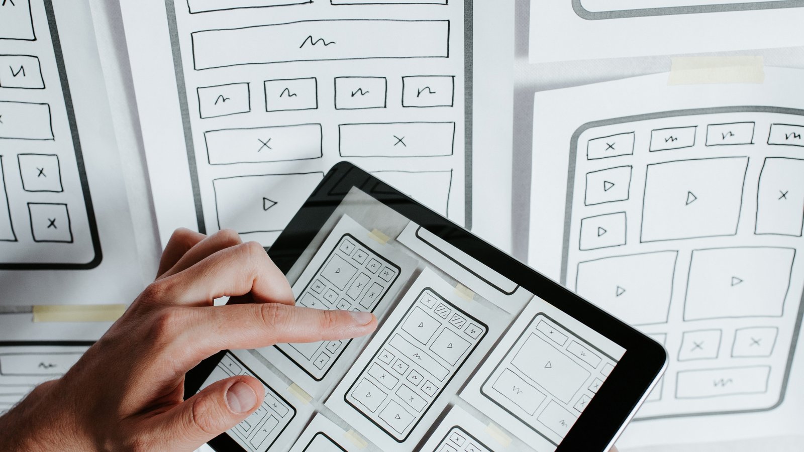
An effective Intuitive Website Design ensures that users can explore content effortlessly, find information quickly, and complete actions without friction. Navigation is more than menus and buttons — it’s the backbone of user experience.
Let’s explore how to create seamless navigation using intuitive graphics and smart design strategies.
Why User-Friendly Navigation Matters
Clear navigation directly impacts:
- Bounce rate
- Time on site
- Conversion rates
- SEO performance
- Brand trust
When users can easily browse your website, they’re more likely to engage and convert. Strong Website Navigation Design enhances both usability and business results.
The Psychology Behind Intuitive Website Design
Users scan websites rather than reading them word by word. They look for visual cues that guide their journey.
Effective UX Design Best Practices rely on:
- Predictable layouts
- Clear visual hierarchy
- Recognizable icons
- Logical content grouping
The easier it is to navigate, the more confident users feel interacting with your site.
Core Elements of User-Friendly Navigation
1. Clear and Structured Menu
Your primary menu should:
- Be visible at the top
- Include only essential categories
- Use simple, descriptive labels
- Avoid jargon
Well-organized Website UI Design ensures users immediately understand your structure.
2. Logical Content Hierarchy
Group related content under clear categories.
For example:
- Services
- About
- Blog
- Contact
Submenus should remain clean and uncluttered. Overloading users with too many options creates decision fatigue.
3. Intuitive Icons and Graphics
Icons enhance Intuitive Website Design by providing visual shortcuts.
Best practices:
- Use universally recognized icons
- Maintain consistent style
- Pair icons with text labels
- Avoid overusing decorative graphics
Simple visuals improve scanning behavior and usability.
4. Sticky Navigation Bar
A sticky (fixed) header remains visible as users scroll.
Benefits include:
- Easy access to menu options
- Improved usability on long pages
- Better mobile experience
This small feature significantly boosts User Experience Optimization.
5. Mobile-Friendly Navigation
With most users browsing on mobile devices, navigation must be optimized for smaller screens.
Mobile-friendly features include:
- Hamburger menus
- Collapsible sections
- Large touch-friendly buttons
- Minimal menu layers
Responsive navigation ensures seamless Conversion-Focused Design.
Best Practices for Website Navigation Design
Keep It Simple
Avoid complex multi-level dropdowns unless absolutely necessary. Simplicity improves clarity and reduces user confusion.
Use Breadcrumbs
Breadcrumb navigation helps users understand where they are within your site structure.
It improves:
- Orientation
- SEO structure
- Internal linking
Search engines like Google favor well-structured navigation systems.
Highlight Active Pages
Visually distinguish the current page in the menu. This reinforces user orientation and enhances clarity.
Prioritize Important Pages
Place high-value pages (like Services or Contact) prominently in the navigation bar.
This supports Conversion-Focused Design and improves lead generation.
Add a Search Function
For content-heavy websites, a search bar helps users quickly locate specific information.
This is particularly useful for:
- E-commerce sites
- Blogs
- Knowledge bases
- Service directories
Common Navigation Mistakes to Avoid
Avoid these errors when designing User-Friendly Navigation:
- Overcrowded menus
- Hidden essential pages
- Inconsistent labeling
- Tiny clickable areas
- Poor mobile responsiveness
- Slow-loading dropdown animations
These mistakes frustrate users and reduce engagement.
How Intuitive Graphics Improve Navigation
Visual elements can guide users subconsciously.
Effective use of graphics includes:
- Arrows pointing toward CTAs
- Visual separators between sections
- Highlight boxes for featured services
- Hover effects on clickable elements
These design cues strengthen Intuitive Website Design without overwhelming the layout.
Navigation and SEO: The Hidden Connection
Good navigation isn’t just about user experience — it also improves search engine performance.
Benefits include:
- Better internal linking
- Clear content hierarchy
- Reduced bounce rates
- Faster indexing
Search engines reward websites with logical and structured Website Navigation Design.
Testing and Improving Navigation
Continuous testing ensures optimal performance.
Use methods such as:
- Heatmaps
- User behavior analytics
- A/B testing
- Usability testing sessions
Data-driven adjustments enhance User Experience Optimization over time.
Trends in Modern Website Navigation
Stay ahead by exploring trends like:
- Minimalist mega menus
- Icon-based navigation
- Floating action buttons
- Dark mode menus
- Micro-interactions on hover
Modern Website UI Design combines simplicity with interactive elements to improve engagement.
The Business Impact of User-Friendly Navigation
Well-designed navigation can:
- Increase user retention
- Improve engagement rates
- Boost conversions
- Strengthen brand credibility
- Enhance overall digital performance
When users enjoy exploring your website, they’re more likely to trust your brand.
Final Thoughts
Creating User-Friendly Navigation is about clarity, simplicity, and strategic design. By combining intuitive graphics with logical structure, businesses can deliver seamless browsing experiences.
To achieve effective Intuitive Website Design:
- Simplify menu structure
- Use recognizable icons
- Optimize for mobile
- Prioritize key pages
- Continuously test and refine
Navigation should feel effortless — when users don’t have to think about where to click next, your website is doing its job perfectly.

Latest Blogs


Categories
Want To Explore More? Check Out Our
Related Blogs

 developer@webvisionsolution.com
March 9, 2026
developer@webvisionsolution.com
March 9, 2026
Content Marketing for Lead Generation: Strategies for Nurturing Prospects in 2026
In the evolving world of Influencer Marketing, brands are shifting focus from celebrity endorsements to…
 developer@webvisionsolution.com
March 9, 2026
developer@webvisionsolution.com
March 9, 2026
The Future of Affiliate Marketing: Trends and Predictions for Success
Affiliate marketing has consistently been a cornerstone of digital marketing strategies, helping businesses grow revenue…
 developer@webvisionsolution.com
March 9, 2026
developer@webvisionsolution.com
March 9, 2026
Google Ads Remarketing: Reaching Your Audience Wherever They Go”
In today’s competitive digital environment, capturing a potential customer’s attention just once isn’t enough. Users…