")
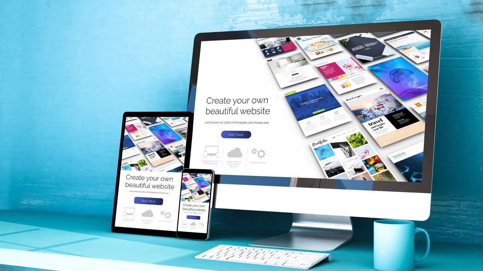
In today’s multi-device world, users access websites from smartphones, tablets, laptops, and large desktop screens.If your website doesn’t adapt seamlessly across all devices, you risk losing traffic, engagement, and conversions.
That’s where Responsive Design becomes essential. A properly built Mobile-Friendly Website ensures your content, layout, and functionality automatically adjust to different screen sizes — delivering a consistent and engaging experience.
Let’s explore why responsive design matters and how to implement it effectively.
What Is Responsive Design?
Responsive Design is a web development approach that allows a website’s layout and elements to adapt dynamically to various screen sizes and resolutions.
Rather than creating separate versions for desktop and mobile, Responsive Web Development uses flexible grids, fluid images, and CSS media queries to ensure a unified experience across devices.
Why Responsive Design Is Important
1. Improved User Experience
A seamless browsing experience enhances User Experience Design by:
- Making navigation intuitive
- Preventing horizontal scrolling
- Improving readability
- Ensuring clickable elements are accessible
Users are more likely to stay and engage with a well-optimized Mobile-Friendly Website.
2. Better SEO Optimization
Search engines prioritize mobile-friendly websites.
With mobile-first indexing, platforms like Google evaluate the mobile version of your site first.
Responsive design directly supports:
- Faster loading speeds
- Lower bounce rates
- Improved search rankings
- Stronger overall SEO Optimization
3. Increased Conversion Rates
If users struggle to browse or complete actions on mobile devices, they leave. A responsive website ensures:
- Easy form submissions
- Smooth checkout
- processes
- Clear CTAs
- Fast page performance
Better usability leads to higher conversions.
Key Principles of Responsive Web Development
1. Fluid Grid Layouts
Instead of fixed pixel widths, responsive websites use percentage-based grids.
This allows content to scale proportionally across devices, ensuring Cross-Device Compatibility.
2. Flexible Images and Media
Images should adjust automatically within their containers.
Techniques include:
- CSS max-width properties
- Responsive image formats
- Optimized image compression
This maintains visual quality while improving performance.
3. CSS Media Queries
Media queries detect screen size and apply specific styles accordingly.
For example:
- Adjust font size on smaller screens
- Stack columns vertically on mobile
- Resize navigation menus
This technical foundation powers effective Responsive Design.
4. Mobile-First Approach
A mobile-first strategy starts designing for smaller screens before scaling up.
Benefits include:
- Cleaner layouts
- Faster performance
- Simplified content hierarchy
- Improved usability
Modern Website Design Services prioritize mobile-first development.
Best Practices for Creating a Mobile-Friendly Website
1. Simplify Navigation
Mobile users prefer:
- Hamburger menus
- Sticky headers
- Minimal navigation options
- Clear page hierarchy
Simple navigation enhances User Experience Design.
2. Optimize Page Speed
Slow-loading websites lose visitors quickly.
Improve performance by:
- Compressing images
- Minimizing CSS and JavaScript
- Using caching strategies
- Choosing reliable hosting
Speed is a critical ranking factor for SEO Optimization.
3. Design Touch-Friendly Elements
Buttons and links must be large enough for touch interaction.
Best practices:
- Minimum 44px button height
- Adequate spacing between elements
- Clear visual feedback on tap
This ensures usability on smartphones and tablets.
4. Use Readable Typography
Small screens require optimized typography.
- Use legible font sizes
- Maintain good line spacing
- Avoid long paragraphs
- Use clear headings
Readable content improves engagement and accessibility.
Common Mistakes in Responsive Design
Avoid these common errors:
- Hiding essential content on mobile
- Using fixed-width layouts
- Overloading with heavy media files
- Ignoring tablet optimization
- Failing to test across devices
Comprehensive testing ensures proper Cross-Device Compatibility.
Tools for Testing Responsive Design
To ensure your Mobile-Friendly Website performs well, use tools like:
- Google PageSpeed Insights
- Google Mobile-Friendly Test
- BrowserStack
These tools help identify performance and compatibility issues.
Responsive Design vs Adaptive Design
| Feature | Responsive Design | Adaptive Design |
|---|---|---|
| Layout | Fluid & Flexible | Fixed layouts |
| Device Handling | Adjusts automatically | Predefined breakpoints |
| Development Complexity | Moderate | Higher |
| Maintenance | Easier | More complex |
For most businesses, responsive design offers better scalability and simpler maintenance.
Future of Responsive Web Development
Emerging trends include:
- AI-driven personalization
- Progressive Web Apps (PWAs)
- Voice search optimization
- Dark mode interfaces
- Motion-based interactions
Modern Website Design Services integrate these innovations while maintaining responsive principles.
How Responsive Design Supports Business Growth
A well-executed responsive website:
- Improves search visibility
- Enhances brand credibility
- Increases engagement
- Boosts conversion rates
- Reduces development costs
Instead of maintaining multiple site versions, businesses benefit from a unified, scalable solution.
Final Thoughts
In today’s digital landscape, Responsive Design is no longer optional — it’s essential.
A high-performing Mobile-Friendly Website ensures:
- Seamless cross-device browsing
- Stronger SEO Optimization
- Improved User Experience Design
- Better conversion rates
Investing in professional Responsive Web Development ensures your website looks and performs flawlessly on any device.
When your website adapts to your audience — no matter the screen — your business stays ahead of the competition.

Latest Blogs


Categories
Want To Explore More? Check Out Our
Related Blogs

 Hyphen Softech
March 9, 2026
Hyphen Softech
March 9, 2026
Content Marketing for Lead Generation: Strategies for Nurturing Prospects in 2026
In today’s competitive digital landscape, simply generating traffic isn’t enough. Businesses need strategies to attract,…
 Hyphen Softech
March 9, 2026
Hyphen Softech
March 9, 2026
The Future of Affiliate Marketing: Trends and Predictions for Success
Affiliate marketing has consistently been a cornerstone of digital marketing strategies, helping businesses grow revenue…
 Hyphen Softech
March 9, 2026
Hyphen Softech
March 9, 2026
Google Ads Remarketing: Reaching Your Audience Wherever They Go”
In today’s competitive digital environment, capturing a potential customer’s attention just once isn’t enough. Users…